How to Design Product Pages That Convert Fast
Your product page plays a critical role in turning visitors into customers-whether you’re promoting a physical product, a digital service, or a SaaS solution. When optimized correctly, it guides users toward action; when overlooked, it quietly drains potential revenue.
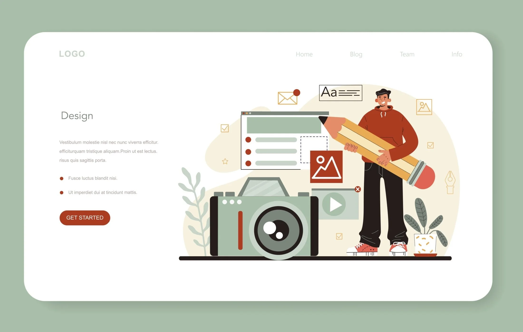
A high-converting product page is more than just attractive design. It’s about clarity, credibility, and communication-helping users instantly understand what you offer, why it matters, and why they should choose you. From layout structure to visual storytelling, every element contributes to conversion performance.
Using the right visuals can significantly elevate this experience. Strategic icons, imagery, and visual cues help reinforce value propositions, build trust, and simplify complex information-making your product easier to understand and harder to ignore.
What makes a product page convert: psychology and intent
Align with user intent and job-to-be-done
Conversion starts when the page matches the visitor’s intent and the job they need to get done. Someone searching “warm waterproof winter boots Canada” isn’t looking for brand poetry. They want to know how warm, how waterproof, and when those boots will arrive. Pages that mirror that language and answer that job create instant clarity and reduce search fatigue.
Picture a commuter skimming on a bus, thumb scrolling past shiny photos. A tight headline that speaks to the task at hand, followed by proof and a fast path to purchase, beats cleverness every time. This shows why intent-led messaging belongs at the top of the page, not buried below the fold.
Reduce cognitive load and decision friction
Use scannable structure, progressive disclosure, and defaults that feel safe. Limit choices to meaningful ones. Remove mystery by showing total cost, delivery estimate, and return terms early. The less mental work, the faster the decision.
High converting product pages: above-the-fold essentials
Clear value proposition and benefit-led headline
Above the fold sets the tone. Lead with a benefit that maps to the job-to-be-done. Back it with a subhead that pins a specific use-case and a concise bullet or two that translate specs into outcomes. Keep copy tight, readable, and specific.
Primary CTA placement and hierarchy
The primary CTA earns attention through position, size, and contrast. Place it close to the price and key options, visible without scrolling on desktop and mobile. Avoid visual clutter around the button. Provide one action that matters most, then secondary actions that don’t compete.
Persuasive copy, social proof, and trust signals
Translate features into benefits and outcomes
Features speak to product capability. Benefits connect those details to results. Use a simple mapping.
Benefit. “Full workday power without hunting for outlets.”
Outcome. “Stay reachable on long site visits.”
Layer in specificity. Materials, certifications, and compatibility matter, but they should serve the story of use, not drown it.
Reviews, UGC, and credibility badges
People trust people like them. Prominent star ratings, review counts, and photo reviews build confidence. Curate highlights that answer common objections. Invite UGC that shows real-life wear and tear, then respond to critical reviews with helpful context. Add third-party trust signals where relevant, like safety certifications, warranty terms, or secure payment icons.
Pricing, offers, shipping, and return transparency
Anchoring, bundles, and promo clarity
Price presentation shapes perception. Use clear anchors, transparent discounts, and bundles that make practical sense. If subscriptions or installment payments are available, state terms plainly and avoid surprises. Keep promo messaging specific and time-boxed.
Shipping costs, delivery times, and policies
Shipping and returns are deal-makers. Preview delivery estimates and costs near the CTA. Clarify return windows, methods, and any restocking fees. For cross-border shipments into Canada, disclose duties and taxes at checkout to avoid post-delivery frustration.
Technical SEO and performance for product pages
Product schema, metadata, and internal linking
Search finds structure. Implement Product, Offer, Review, and Aggregate Rating schema so search engines can understand price, availability, and ratings. Write unique meta titles and descriptions that match intent and include the primary keyword naturally.
Core Web Vitals, lazy loading, and image SEO
Speed is a trust signal. Aim for strong Core Web Vitals. Fast first view, responsive interaction, and stable layout matter to both search and shoppers. Use lazy loading for below-the-fold media, modern formats like WebP or AVIF, responsive images, and smallest-possible scripts.
Design High-Converting Product Pages with Headstartt
Designing a product page that converts fast requires more than just good visuals-it demands the right strategy, structure, and conversion-focused execution. At Headstartt, we help brands turn underperforming product pages into high-converting assets by combining CRO best practices, user behavior insights, and performance-driven design.
From optimizing layouts and CTAs to aligning messaging with audience intent, our approach ensures every element on your product page works toward one goal: conversions.
If you’re ready to improve conversion rates and build product pages that truly perform, request a quote and let Headstartt help you design pages that convert faster and smarter.
FAQs
What elements drive the highest product page conversions?
Clear benefit-led headlines, high-quality media, a prominent primary CTA, transparent pricing and delivery info, fast performance, and social proof. When these align with user intent, conversion rates rise and decisions happen faster.
Do product videos increase conversion rates?
Short, outcome-focused videos often help, They reduce uncertainty by showing real use. Keep them concise, captioned, and optional. The impact grows in categories where motion or fit is hard to convey in stills.
How fast should a product page load to avoid drop-offs?
Pages that feel instant retain momentum, Strong Core Web Vitals correlate with better engagement and search visibility. Focus on fast first view, responsive interaction, and stable layout rather than chasing a single number.